Update on Beta Version Bugs and Feedback
Thank you so much to those who have provided us such invaluable feedback on our exciting new updates! Here is what we have done so far:
- Fix footer typos for Aprende inglés gratis and Conjugación de verbos
- Fix the "More" link on a user's profile page for their Answers
- Fix the Rollback function when looking at a post's history
- For the title links to Answers posts, add the first line of the body to the title when a user mouses over
- Fixed the squished avatar in top right in IE8
- Added a label to the navigation searchbox to clearly show it's for a dictionary and translation search
- Added the accent button toolbar to the writing section in the learn area
- Darkened the color of the blue links
- Improved the look of the site when printing (to tolerable)
- Updated many misspellings listed on: http://www.spanishdict.com/answers/216288/please-help-us-find-mistakes-on-this-site
- Fixed the bug on the profile page related to the timestamp of when people joined
- Added the accepted tick mark on the browse page when a page is accepted
- Increased the contrast of the header text
- Fixed the bug with /translate/leer to ensure that the Spanish to English translation shows first
- Added audio to the phrasebook
Please continue to send us more feedback on all sections of the site and any mistakes that you see. We are working hard to catch all things but need your help to make it perfect!
Muchisimas gracias!
20 Answers
I, as Gekko, keep on claiming for correctness in the Spanish part of this site. This is a learning forum, supposedly for learning Spanish, isn't it?
This is what you can see, just picking one example (and not a matter of tildes)
Tú votó para Update on Beta Version Bugs and Feedback (hace 5 minutos)
This seems a bad joke.
In the lines of Pesta's post:
If a Spanish speaker visits the site for the first time and reads this, they will think the site was written by incompetent speakers, or more likely, it's been translated by a machine, and probably will leave and not return. Being this a Spanish learning website, this is just not serious.
Please, consider correcting these serious mistakes before adding more mistakes to the Beta version (the issue of the new learning matherials falls apart)
Currently, the search results are ordered by how prevalent the query is within the post and it's answers. Can you give me an example of what you have tried to look up? - martha3
HI Martha, when I was asked what was most important to change on the site, like half a year ago, my first indication was the search engine.
It is just not serious that I write "Martha" into the search engine on "users" , three pages turn up and you are NOT among those mentioned being an administrator! Type in Heidi and the same happens. and lazarus, ray (all of whom members with over a 100k rep points) , , same story, they do not appear to be members here. Actually , names and members turn up that have nothing to do with either name. Very odd.
Unless you know the EXACT name of the user, he just can't be found.
You type into the search function on the forum "café" and my post with over 3000 posts comes up as the seventh thread, surpassed by seven posts with one or two answers.
Type into the search engine on the forum "drop" and my thread with over 7000 posts turns up on the SECOND page. Same with rabbit's thread, with over 50 posts.
We need an advanced search, with a selective search for usernames and posts and the searches must be filterable, or at least sortable, in order to be of any use. We need to be able to search by combined keywords, and sort by date and creator, That way anybody could for example try to find a post/thread written by our famous Lazarus, without going crazy.
(added gekko's suggestion)
I did a forum search and thought it would really be great if there was some sort of order to this. Maybe there is but I can't see it if so. There have been times when I was looking for a particular post that it would have been helpful for the return to be in order of date of first post or by number of votes or answers. Thanks
We still have a Huge bug in the answers page list.
This bug existed in the old site, and continues in the new site.
It affects primarily Internet Explorer.
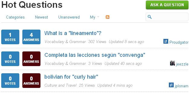
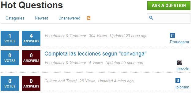
Here's what the list looks like in Firefox:
Here's the same list taken at the same time, in Internet Explorer:
If somebody visits the site for the first time, and is using Internet Explorer, they will see this and think the site was made by incompetent amateurs, and probably will leave and not return.
I won't insist everything work in Internet Explorer, but this is major. It is also not hard to fix.
The problem is due to the feature that shows the first line of the message body as a little popup when the mouse is hovered over the title text of a post.
The HTML to produce this uses the "Title" attribute. It might look like this:
Title="A client has asked for us to provide a "lineamento" in connection with a consulting proposal"
Do you see the problem?? The text contains quote marks, and is itself enclosed in quote marks. HTML standards are violated here by SD's page, and no browser treats this correctly. Firefox doesn't work right either, but manages to keep the Bad HTML working. Internet Explorer simply fails to show the title correctly as well.
The correct HTML for this case should look like this:
Title="A client has asked for us to provide a & quot;lineamento& quot; in connection with a consulting proposal"
Do you see the difference? Yes, it's those & quot; characters.
Martha, you may not know what I'm talking about, but give this to your programmer and he should know exactly what this means, and should blush when he sees what a simple mistake this is. It is a common rendering issue and is done correctly by thousands of websites.
If we don't fix it, we ought to post a loud disclaimer on the page header to tell users which browsers to use. ![]()
(Note, I had to add a blank between the "&" and the "quot;" to keep SD from converting the code to a quote character. No blank belongs there in the actual text.)
I am pleased to see that you have kept busy, and have made an effort to incorporate the feedback comments.
I see that you fixed that "Pérfil" thing in the Spanish interface. However, there are still lots of mistakes in the Spanish profile:
Tú ganaste 10 rep para ser votado arriba de una respuesta de
All these "Tú" should be eliminated. It might be better to say: "Ganaste 10 Rep por recibir un voto por una respuesta..."
Tú ganaste 1 rep para votar arriba una respuesta de
Maybe: Ganaste 1 rep por votar por una respuesta...
Tú ganaste 100 pts para la 'mirar' sección de
Maybe: Ganste 100 pts. por la sección de "observar" de...
Tú preguntaste la pregunta
Redundant: Maybe: Hiciste la pregunta...
Fluent: Fluído
This section really should be thoroughly checked with native speakers, in my opinion.
Finally, my pet peeve remains unanswered: the microscopic avatar icons inthe Q&A section are still microscopic. What use are they like that?
Thanks.
Hi Martha! I don't know much about programming, but I know that this site represents a lot of hard work and dedication. Thank you so much!!
I can't speak to the appearances since I have overridden MS fonts and colors and put in my own personal preferences. I'm more interested in the functionality of the site, and I see improvements put into place every day. The dictionary is starting to make sense again ![]() . The "page bounce" when ads loaded is gone (thank you!!) and the keyboard Enter function now works on the translate page.
. The "page bounce" when ads loaded is gone (thank you!!) and the keyboard Enter function now works on the translate page.
Many of us miss the instant translations that were available by double click for virtually every word. I see that many have been installed and I hope this trend continues. The hyperlink that would take you to that word's dictionary page made searching the dictionary so much more efficient. Any plans to bring that back?
I REALLY appreciate the reorganization of the reference section. The layout is well done. The quizzes are just terrific. I can't tell you how much I needed these! I have some proofreading notes to send to feedback on this section. I hope they will reach the right person.
If I think of anything else I will let you know. ¡Bien hecho!
I know this has been said it's in progress, but just for the record... the double-click a word to translate function still isn't working. :-(
Another issue the Beginners Guide to SpansihDict Needs to be prominant along the top somewhere so every new user has access to it without having to ask.
In a nutshell...
I could not put my finger down on a specific one single factor, but I find that I feel comfortable with the "old" site, and I have to force myself to open the Beta version. There is something about the visual layout and design that just bothers my eyes... Ah yes, I can see it now! I opened both side by side. The blue text is harder to read, and tiring on the eyes. And the tiny avatar icons provide no ready information about who is submitting the post. In the old version I can immediately see who opened the thread, and what their reputation is. In the beta version I have to mouseover on top of the teeny, tiny, little icon, (did I mention I hate those micro-icons? Just making sure...), in order to see a bubble with the information. Not a huge effort, but why hide something that was usefully in plain sight before, and didn't clutter the interface at all?
Anyway, I do think is the large, blue text that bothers me most.
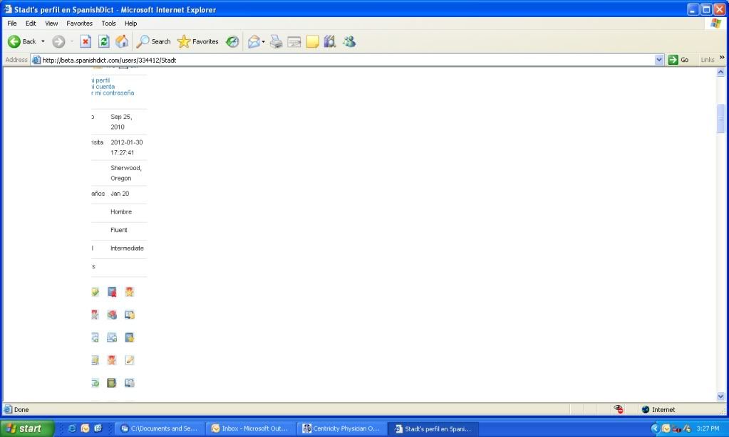
This is my view of my profile as I view the site from work. Although I have given up all hope that the version of IE that I am forced to use at work will be compatible with the new SpanishDict version (the reason things are cutoff on the left hand side of the screen on my view and the reason that everything is in a tight narrow band and not filling the page- I am not sure I will even be able to use the site once it is the official version), I will note that when set to Spanish the language levels and birthdate are still listed in English, although sex is in Spanish.
Given the number of users that are learning both English and Spanish with a native language that is neither, I will also make yet another plug for a third category of “native language”. (I am assuming it is not there somewhere in the part that I cannot read).
Hello Martha
Thank you for all the hard work you are doing on our behalf to improve the facilities on the Beta version of SpanishDict and for all the tremendous work you have already done on our present site.
Please would it be possible to extend the drop-down box: which currently shows just 4 levels of ability in Spanish, to include a wider variation of ability in both Spanish and English? I am requesting it particularly with regard to Spanish to more accurately reflect an individual's level and improvement than the current system which just records beginner, intermediate, advanced and fluent.
I would suggest/propose these 7 levels;
1 Beginner
2 Pre-intermediate (new category)
3 Low intermediate (new category)
4 Intermediate
5 High intermediate (new category) This is the level that I believe I have reached taking into account the comments/feedback that I have received from natives and advanced users over the period of almost 2 years since I first arrived here.
Of course there is no official way of showing this on a profile as yet. It would seem an ideal time to introduce new categories when the Beta/trial version is in the process of being introduced. Many people I know have made great progress and Heidi has commented on their progress in Skype but the limitations of 4 categories means you cannot change your category easily. , For example,you have to stay at Intermediate until you reach an advanced level.
6 Advanced
7 Fluent
Adding Avatar function in the beta site is not working. I tried to add the profile picture through the beta site, and it was not working, although the file size was only 16K. Then I logged onto the original site, and I was able to add the profile image right away.
...oh, and a decent search engine, please!!
I find the beta site to be slower than the old site. Is that because it is still in beta? Also, I liked the way badges and scores are displayed on the original site. It may sounds funny, but it does give me some motivation to keep going ![]() .
.
Thanks for all the hard work you are doing behind the scenes.
One thing that has always bugged me is that when you do a search it goes you results from the whole forum. Would it be possible to refine the search function so we could search just the Reference section for example?


